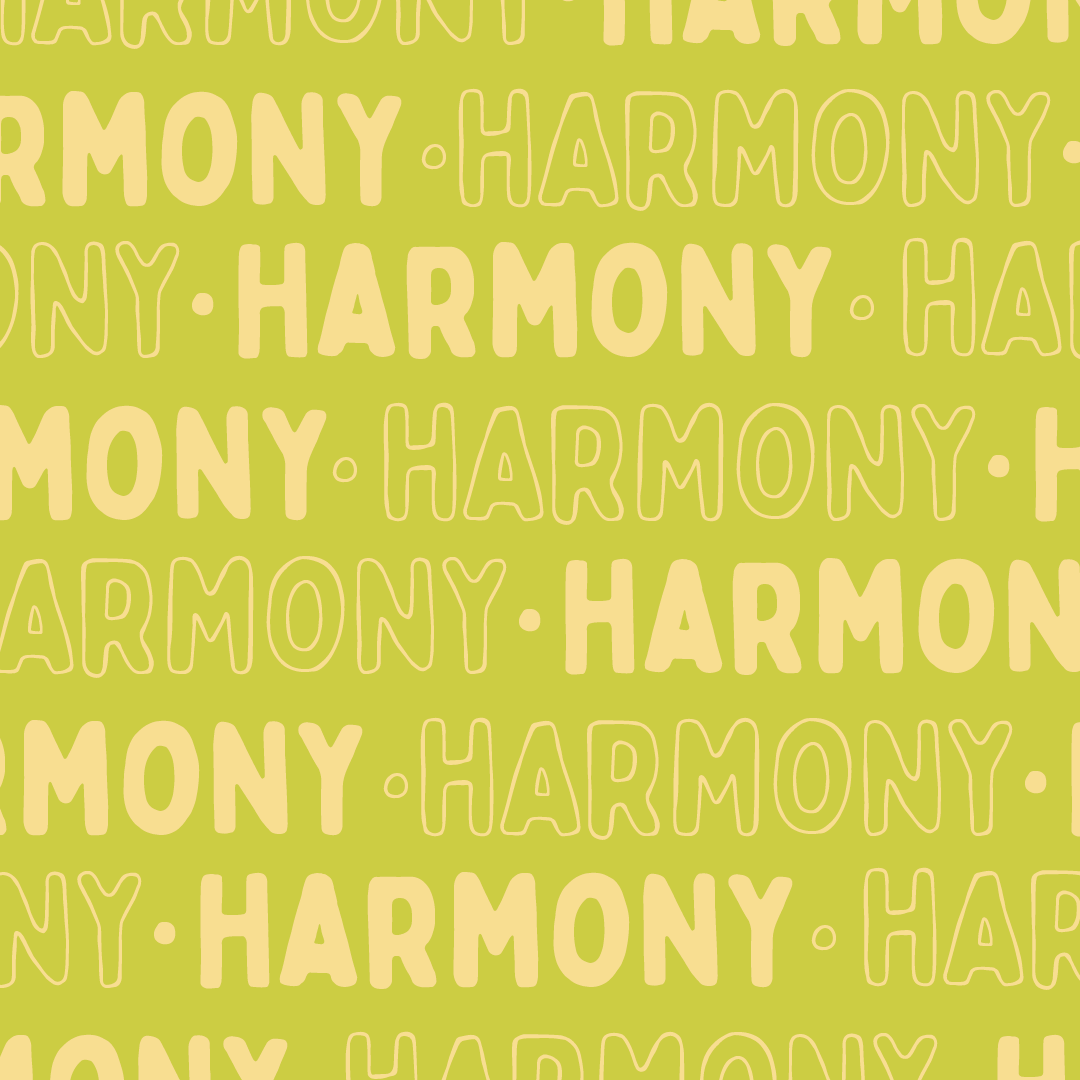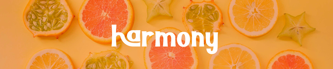
Harmony Social Media & Logo
TASK
Harmony sought a visual identity that reflects the simplicity, vibrancy, and joy that defines their approach to healthy living. The logo and social media posts should convey simplicity, accessibility, and playfulness.
Choose a color palette that is fresh, inviting, and energizing.
Consider playful typography that adds character to the logo.
BACKGROUND
Harmony is synonymous with accessible, fun, and easy healthy living. They empower individuals to embrace a lifestyle that promotes well-being without complexity making positive choices not only achievable but delightful.
TARGET AUDIENCE
The primary audience comprises women of all ages and backgrounds who are seeking a stress-free and enjoyable approach to healthy living. Whether they are beginners or wellness enthusiasts, Harmony is designed to resonate with those who prioritize simplicity and fun in their wellness journey.
Young Professionals: Women in their 20s and 30s who are career-focused and seek a balanced and healthy lifestyle
Wellness Seekers: Women who actively pursue holistic well-being, including mental, emotional, and physical health.
#HARMONY
DELIVERABLES
• Name
• Logo
• Social Media Posts